It is done

For this lovely title page I drew up a simplistic old timey line art of a bottle with hands and tentacles and all that good stuff. I also changed the name of the whole thing from "The Ocean" which is admittedly quite boring, to the much more exciting "Nautical Nonsense", which is of course inspired by Spongebob. I'm quite proud of how this title page turned out, it's nice and simple and I managed to sneak another quote from The Mollusk onto the bottle.


I CANNOT REPEAL THE WORDS OF THE GOLDEN EEL
It's inspired by another song off The Mollusk, that's just how it goes, it's expected at this point.
Anyway, it turned out great, the lighting on the eel and the fade on the parts of it's body that are further away look pretty swell. And it has a nice sense of scale with that little diver who's learning important life lessons from this thing. I probably could've put more texture on the foreground eel bits though.


I whipped this one up in Drawchris' class a while back and gave it a big fix for it's inclusion. I made the foreground extremely dark to fit with the rest of the theme. It's a simple image, but it's a nice one.
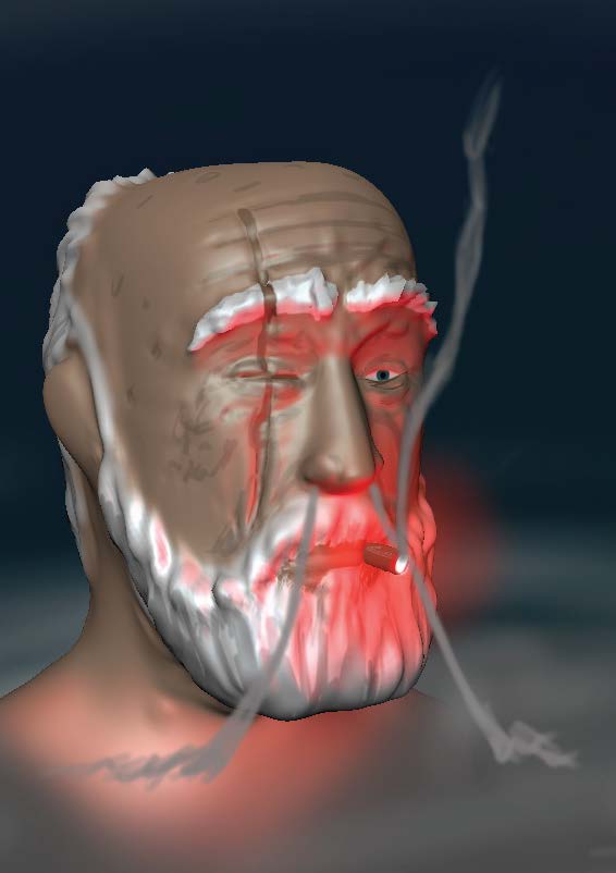

This guy. He looks alright, I don't know enough about 3D stuff though, I've got a lot to learn.


AND THE MOLLUSK LINGERS WITH IT'S WANDERING EYE
This one turned out quite nice too, a boy is picking up shells as all these ominous sea creatures watch over him. I feel like I definitely could've put more detail on the boy and the shell he's picking up as well as improving the scale of the background creatures. I don't know if I should've made more of them, or just made the colours POP more, but I definately could've scaled it up a bit.


A 3D printed lighthouse, It is really simple but it turned out looking good. There was a damn big struggle printing it though and I don't really understand any of the reasons why it wasn't working. I really have to brush up on my 3D knowledge.
The clock though, I'm really happy with, it's really nice and simple and I genuinely wouldn't mind having that as a real clock.


I am the walrus.
This one turned out real great too, man what a spooky walrus.


The photos are nice and simple, there were some simple edits, but they do look quite nice, I really like how the lighthouse one turned out, there's much more of a focus on the sky than the building and somehow it just feels good. Also, you know I slapped some quotes from The Mollusk on there, never gets old.
I am indifferent about these kaleidoscopes.


This lonely man is having a bonfire on the beach. It looks alright, the fire and the waves look prett great if I'm going to stroke my ego a little bit. But the man looks a little bit like nothing in particular, he's a bit dull. All round a pretty nice one.


Pipes.
Another one from Drawchris' class. It's a lot brighter than the others, but I think it still fits in nicely with the theme. The whole pipes intruding on nature bit. I also snuck in a couple of Nemo references.

The last one, it's a bit of a blurb. It has a nice callback to the title page and I also APA referenced those ween quotes.
Comments
Post a Comment